Hedonometer

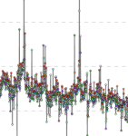
Website using computer sentiment analysis to analyze the average "happiness" of Twitter over time and graph this data. They also mark specific high and low points to show what was happening that day to make people happy or sad.
Especially interesting that if you look at the full graph for "original tweets only" you can really see a decline in happiness over time leading up to the pandemic, and then it really bottoms out during the pandemic, and then it recovers but still isn't as high as it was in the early 2010s. I feel like that tracks with the general social media experience, lol. (also RIP twitter, but this is still a cool thing!)
Especially interesting that if you look at the full graph for "original tweets only" you can really see a decline in happiness over time leading up to the pandemic, and then it really bottoms out during the pandemic, and then it recovers but still isn't as high as it was in the early 2010s. I feel like that tracks with the general social media experience, lol. (also RIP twitter, but this is still a cool thing!)